You can display VertiGIS FM data for any products or data objects on the database using a bar, line, or pie chart.
Bar Chart
Pie Chart |
Line Chart |
To create a chart for your dashboard, create a new dashboard object and select Chart from the Presentation Type menu.
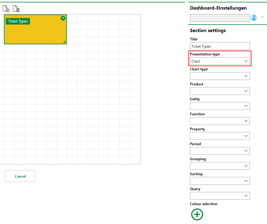
Chart Dashboard Object
The following inputs are required or optional when creating a Chart dashboard object.
Chart Dashboard Object Inputs
Setting |
Description |
||||||
|---|---|---|---|---|---|---|---|
Chart type |
The type of chart in which you want to visualize the data. You can select •Bar •Pie •Line •Predefined Refer to the images above this table for examples. |
||||||
Product |
The VertiGIS FM product associated with the data object whose data you want to capture in the chart. |
||||||
Entity |
The data object (e.g., buildings, devices, or service desk tickets) whose data you want to show in the chart. |
||||||
Function |
How the chart will show numeric data for the Entity and Property you've selected.
You only need to select a function if you are creating a chart to show numeric data. To leave the Function field blank, click in the menu and select the blank option at the top of the list. If you do not select any option from the menu, VertiGIS FM will prevent you from saving the dashboard object. |
||||||
Property |
The property of the object selected in the Entity menu whose data you want to show in the chart. •If you left the Function menu selection blank, select a property that all instances of the object selected in the Entity menu that you want to include in the chart share. If you select Location, for example, only data for objects with a Location property will be included in the chart. If you want to include data for all instances of the object selected in the Entity menu that exist in the database, select a mandatory property for which all objects have a value, like the name or asset number. •If you selected an option in the Function menu, you will only be able be able to select properties with numeric values. |
||||||
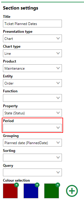
Period |
The period of time over which you want to see data in the chart. This menu is only available if you select Line from the Chart Type menu. |
||||||
Grouping |
The property of the object selected in the Entity menu that you want to use to group or tabulate objects in the chart. |
||||||
Sorting |
|
||||||
Query |
Optionally, a query whose criteria you want to use to filter the instances of the objects selected in the Entity menu. Instances of the object selected in the Entity menu that do not meet the criteria of the selected query will not be included in the chart. Only queries associated with the object selected in the Entity menu can be selected. Refer to Save Queries for instructions on how to create a query. |
||||||
Filter expression |
A filter expression that limits the instances of the data object reflected in the counter. Advanced system knowledge and knowledge of filter expression syntax is required to use this feature. The Filter Expression field is only visible for users assigned roles that have the Define your own filter expressions permission enabled. It is only intended to be used by administrators. |
||||||
Color selection |
The color(s) you want to appear in the chart. Refer to Color Selection. |
Chart Examples
The sections below show examples of customized charts using VertiGIS FM data.
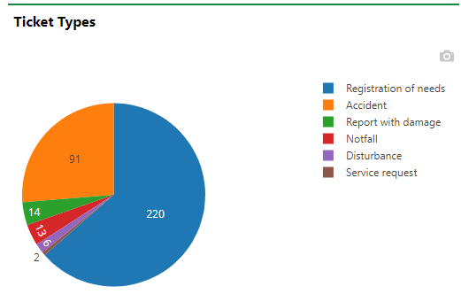
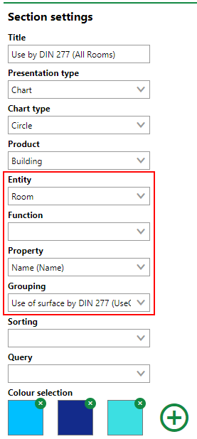
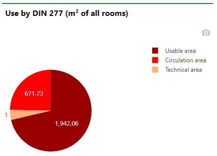
Parts of Data Object Total
In the example below, the chart shows all rooms with a Name property in the database and groups them using their Use of Surface by DIN 277 property.
|
|
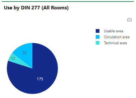
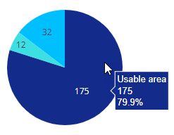
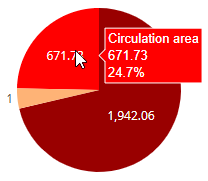
You can hover over a section of the chart to view the percentage of all objects in the category.
Viewing Percentage of Chart Section
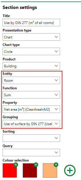
Parts of Data Object Property
In the example below, the chart includes all rooms with a Net Area [m2] value. VertiGIS FM adds up the net area of all rooms based on their Use of Surface by DIN 277 property. This shows the percentage of floor area assigned to each DIN 277 category across all rooms, instead of the percentage of rooms assigned to each category, as in the example above.das
|
|
You can hover over a section of the chart to view the percentage of all objects in the category.
Viewing Percentage of Chart Section
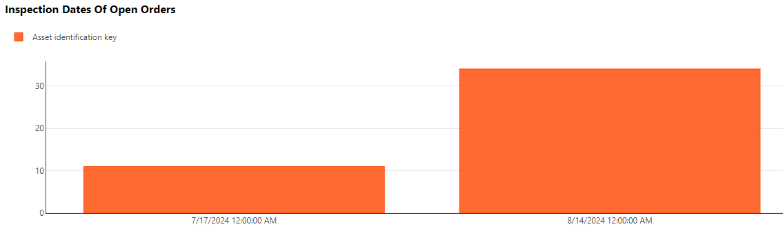
Data Object with Time-based Property
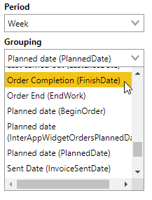
When you create a line chart, an additional Period menu becomes available in the Section Settings. Using this menu, specify the period of time over which you want to see the data. When you specify a period of time, the selectable options in the Group menu become limited to properties of the data object selected in the Entity menu whose values are dates (for example, an order's planned date or end date).
Data Object's Properties with Date Values
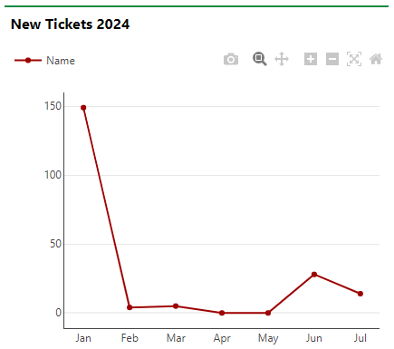
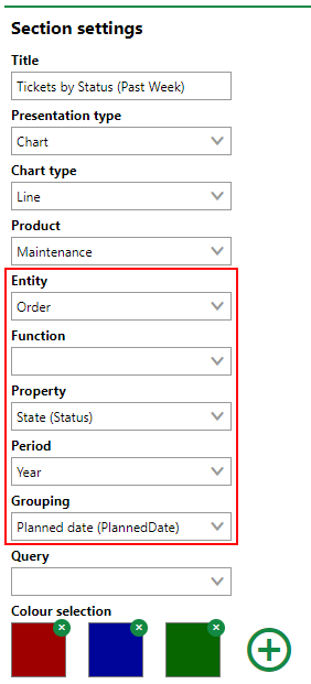
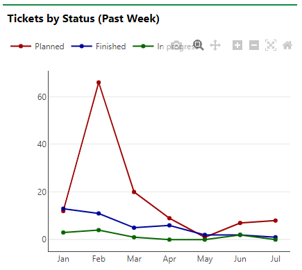
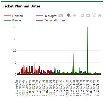
The resulting chart shows the values for the property selected in the Grouping menu over the period of time specified in the Period menu for the object selected in the Entity menu, separated using the property selected in the Property menu. The example below breaks down orders by their status and, on the x-axis, shows how many orders have a Planned Date property whose value falls in the current year. As reflected in the line chart below, most orders with a Planned Date for this year had a Planned Date in February.
|
|
If you do not specify a Period, the Planned Date for all orders are accounted for in the x-axis of the chart, and the values are not connected by a trend line.
|
|
Color Selection
In the Color Selection section, you can specify what colors you want to appear in the chart. Different colors and properties in the chart display in different colors.
Click the ![]() icon to add a color.
icon to add a color.
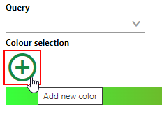
Add a Color Button
Click the square and select a color using the picker.
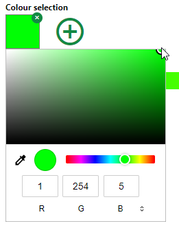
Color Picker
You can also type in a color's RGB code in the R, G, and B text boxes.
Add as many colors as there are objects or properties shown in your chart.
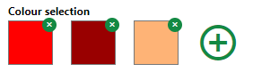
Set of Color Selections
The colors appear in the selected chart when you save the dashboard object.
Selected Colors Displayed in Chart
If you do not add any color selections to a chart, VertiGIS FM uses default colors.