A heatmap is a visual that depicts values of a given variable across two axes using color. In VertiGIS FM Energy, heatmaps represent energy consumption in each month of the year for a set of years you specify. Generally, they indicate annual consumption trends, like the times of the year that consumption of a particular energy form is higher or lower, and make it easy to spot fluctuations in energy consumption.
For example, the heatmap below indicates that at the building in question, heating consumption is higher during the fall and winter months than during the spring and summer months.

Heatmap for Heat Consumption
To see consumption data in a heatmap for an asset, select a building in the Buildings section, a service area in the Service Areas section, or a metering point in the Metering Points section on the Energy Report page and click the Heatmap (![]() ) icon.
) icon.

Building Heatmap Icon
You can see heatmaps for heating, electricity, or water consumption for a building, service area, or metering point you select on the Energy Report page. You can show or hide heat maps for a given energy form using the check boxes in the Medium section at the top of the page.

Show/Hide Heatmaps per Energy Form Check Boxes
The vertical gradient to the right of the heatmap indicates what consumption values the colors in the heatmap represent. Colors are assigned to values programmatically based on the consumption values in the dataset for the selected building, service area, or metering point.
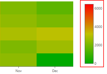
Consumption Value Legend
The colors in the heatmap represents the building, service area, or metering point's consumption for the month and year indicated by its place on the graph. The green square in the 2021 row and January column indicates that water consumption in January 2021 was relatively low compared to the consumption in the same month in 2020, 2022, and 2023.
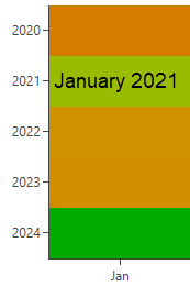
Consumption for Month and Year Indicated by X and Y Axes
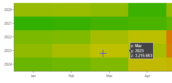
You can hover over a square in the heatmap to see the exact consumption for that month and year. The z-value indicates the consumption in the unit associated with the metering point or the consumption of the metering points that measure the selected energy form for the building or service area. The example below shows the exact consumption for metering points associated with water consumption in a building for March 2023.
Energy Report Icon
By default, heatmaps in VertiGIS FM Energy show each month of the year on the y-axis. You can specify which years are shown in the x-axis in the Filter section at the top of the page.
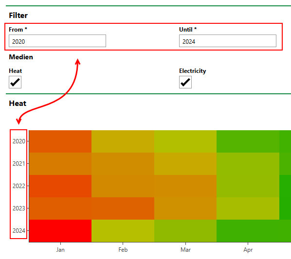
Heatmap Year Range Inputs
You can only show a complete sequence of years in a heatmap in VertiGIS FM Energy. You cannot omit a single year within a sequence from a heat map.
You can interact with the chart(s) outlined above using the controls in the top-right corner.
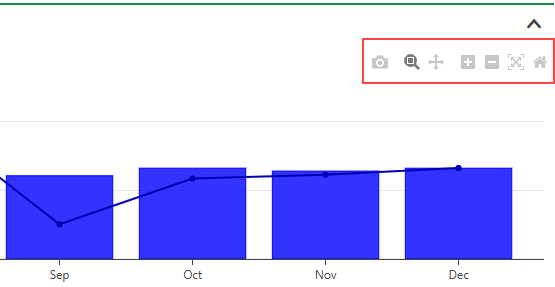
Consumption Chart Controls
Consumption Chart Controls
Icon |
Function |
|---|---|
|
Download a .png image file of the chart to your computer. |
|
Allows you to draw a square on the chart by clicking and dragging. When you release the mouse, the chart zooms in to the selected area.
Selected Chart Area This tool is selected by default. You only have to click the icon before drawing an area if you have clicked another one of the icons. |
|
Move the focused area of the chart up, down, to the left, or to the right by clicking on the chart and dragging. |
|
Center and zoom in on the chart. |
|
Center and zoom out on the chart. |
|
Scale the chart to fill the width of the chart area. |
|
Undo any zooming, panning, or scaling so that the chart is centered and scaled. |
